Nose Dive
Branding & Packaging Design
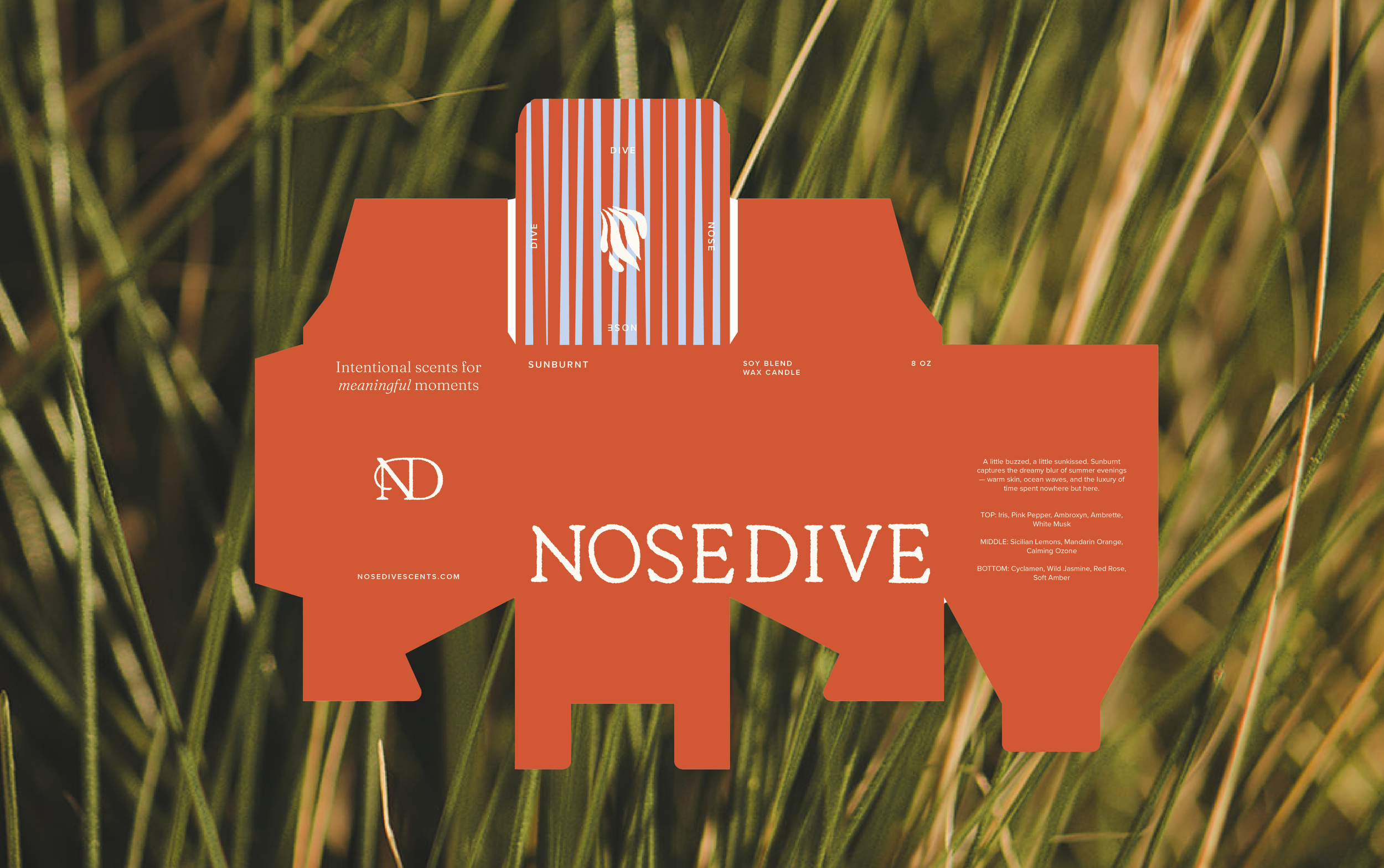
Not just a candle, but a memory wrapped in scent. We partnered with Nose Dive to craft a brand identity and packaging system that honors the art of slowing down and savoring everyday rituals. From logo to packaging, every detail was designed to feel intentional, nostalgic, and quietly luxurious.
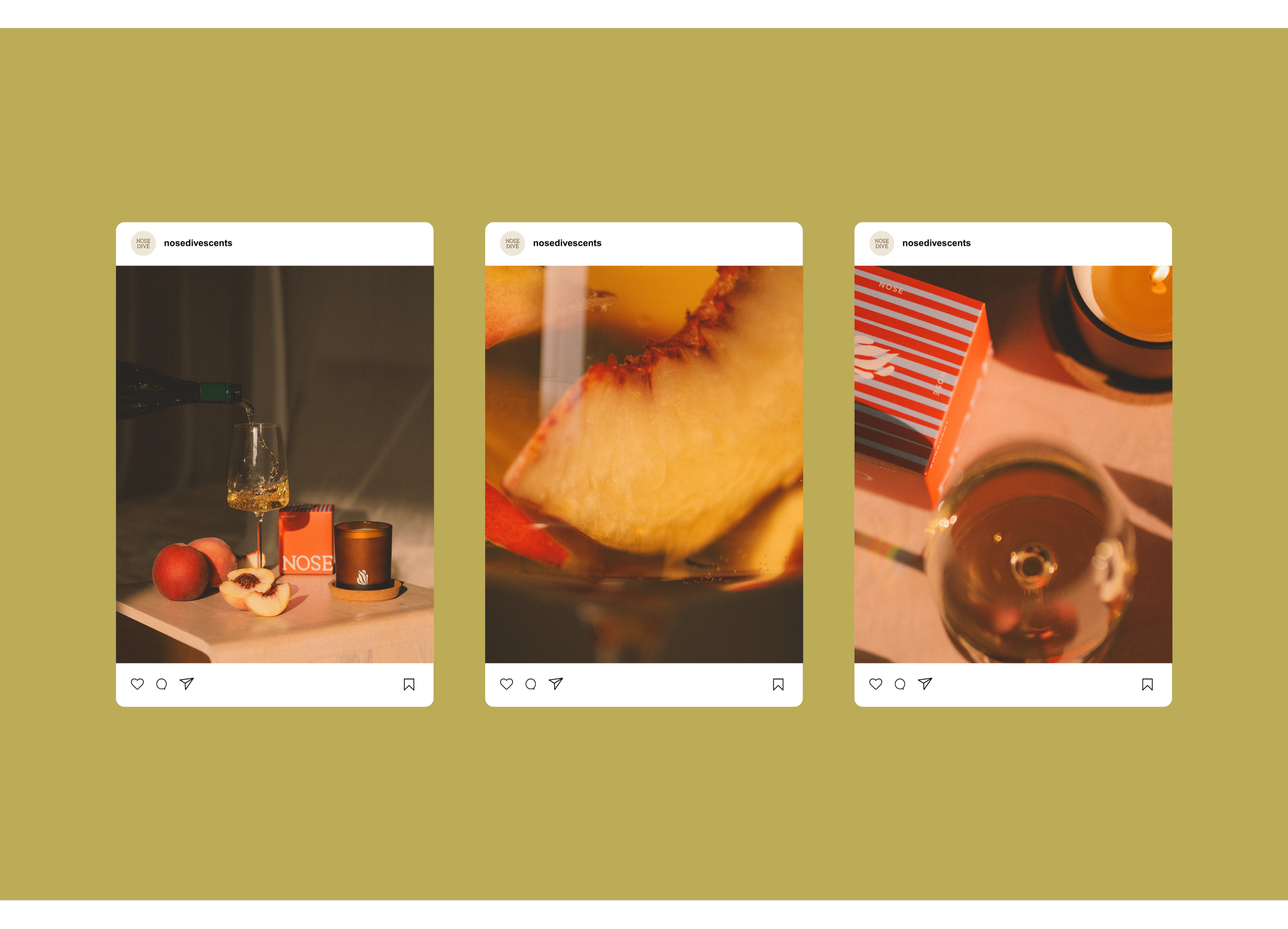
Photography by: Sophia El’Rae

A look into our
Project Goals

Nose Dive is rooted in the magic of memory—those fleeting moments we never want to forget. Founder Tanner envisioned a brand that felt personal, sensory, and elevated—a love letter to scent and story. We brought this vision to life through a creative direction grounded in organic textures, calming neutrals, and soft hand-drawn details. The brand’s logo—a whimsical yet refined flame that doubles as a budding flower—captures the essence of transformation, ritual, and presence. Paired with heritage-inspired typography and a color palette that gently shifts across scent variations, the visual identity feels both collected and contemporary. Packaging features tactile illustrations, nostalgic patterns, and playful colorways that bring each candle to life. The result is a brand that feels effortlessly soulful and ready to grow—a true reflection of the moments it’s meant to honor.


