Like Mossie
Branding design
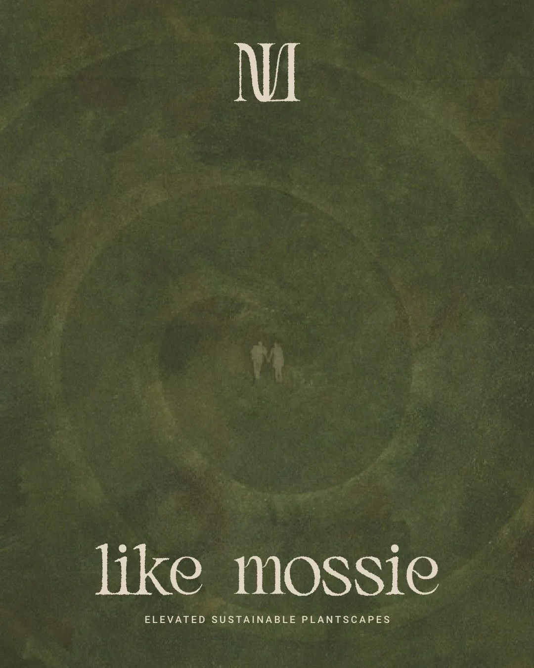
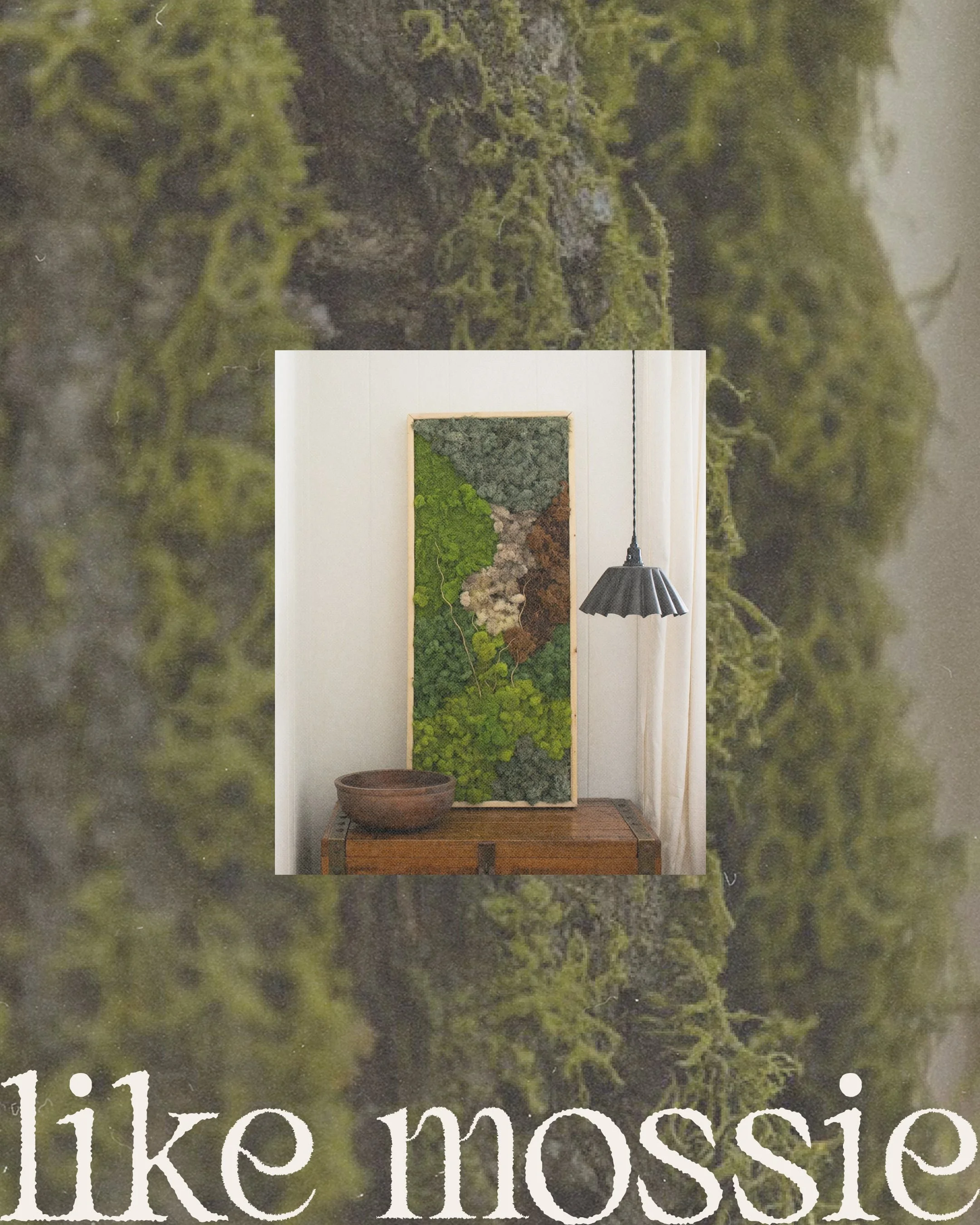
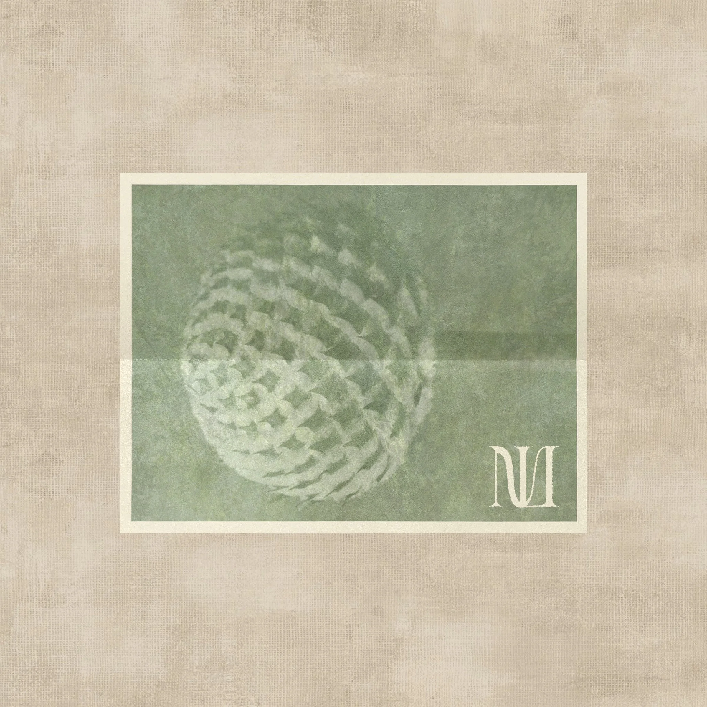
Like Mossie crafts exquisite, handcrafted plantscapes designed to elevate spaces and bring nature’s magic indoors. Owner Ashley approached us with a vision: a professional, artful, and earthy brand that resonated with high-end clients. Our deliverables included a bespoke logo suite, custom icon, typography styling, brand strategy, and a thoughtfully curated color palette.
A look into our
Project Goals
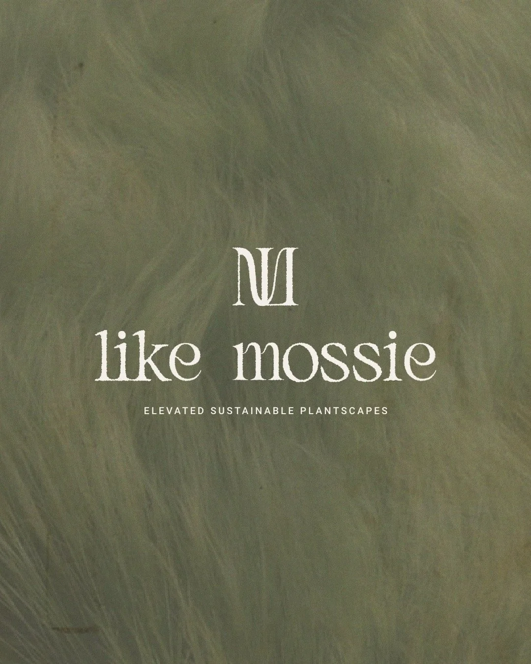
Ashley’s mission of creating timeless, sustainable plantscapes inspired us to design a brand identity rooted in nature’s beauty and elegance. We crafted a soothing color palette of sage, earthy brown, and powder blue, evoking tranquility and grounding. The hand-lettered logo intertwines the “L” and “M” like naturally grown moss, symbolizing organic connection and the artful essence of Ashley’s creations. Through careful typography, a subtle foliage icon, and a brand story that highlights her craftsmanship, we transformed Like Mossie into a sophisticated, heartfelt identity. Ashley’s elevated brand now attracts her ideal clientele, capturing the magic of nature and infusing it into her customers’ homes.