Jo D’or
Brand IDentity Design
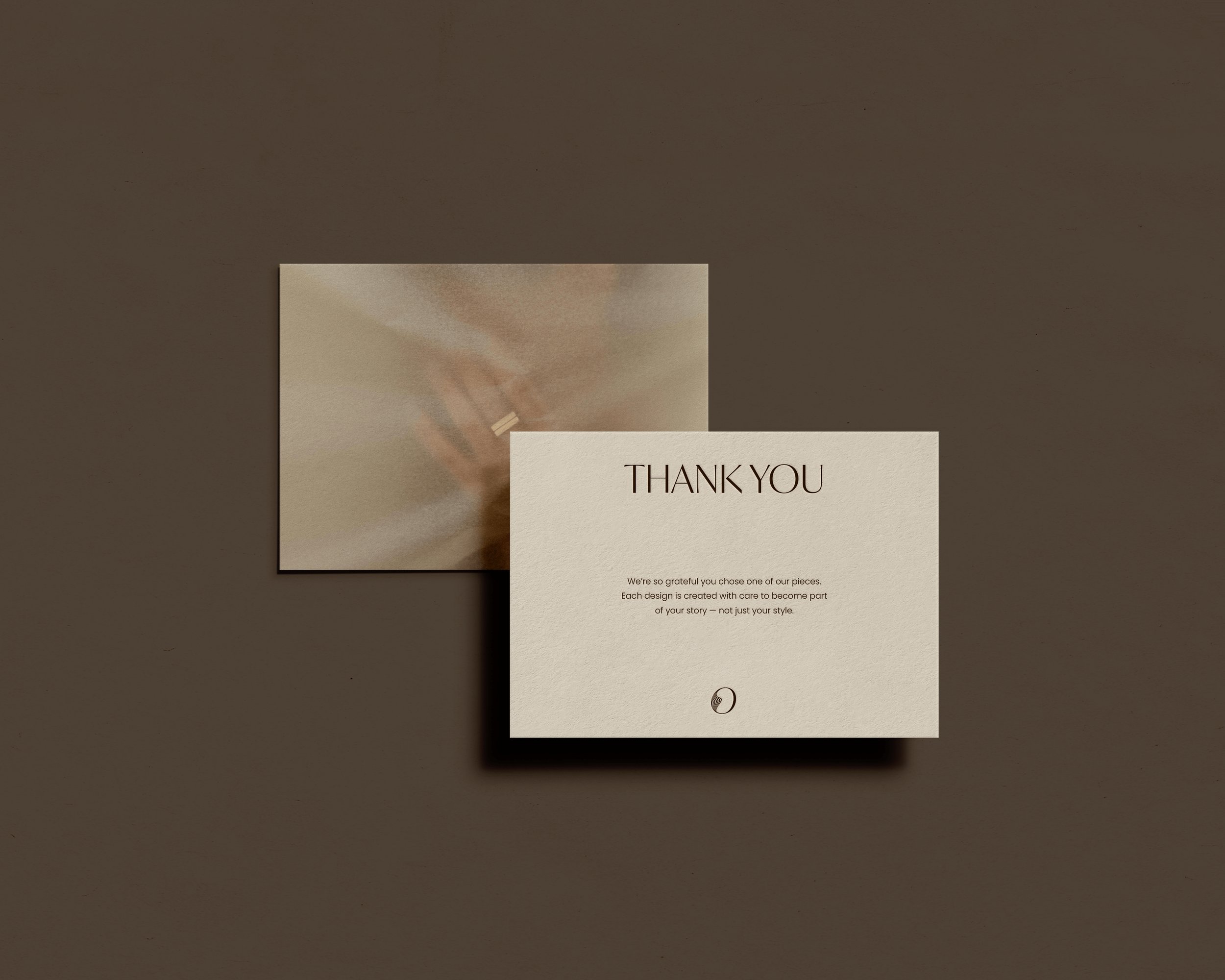
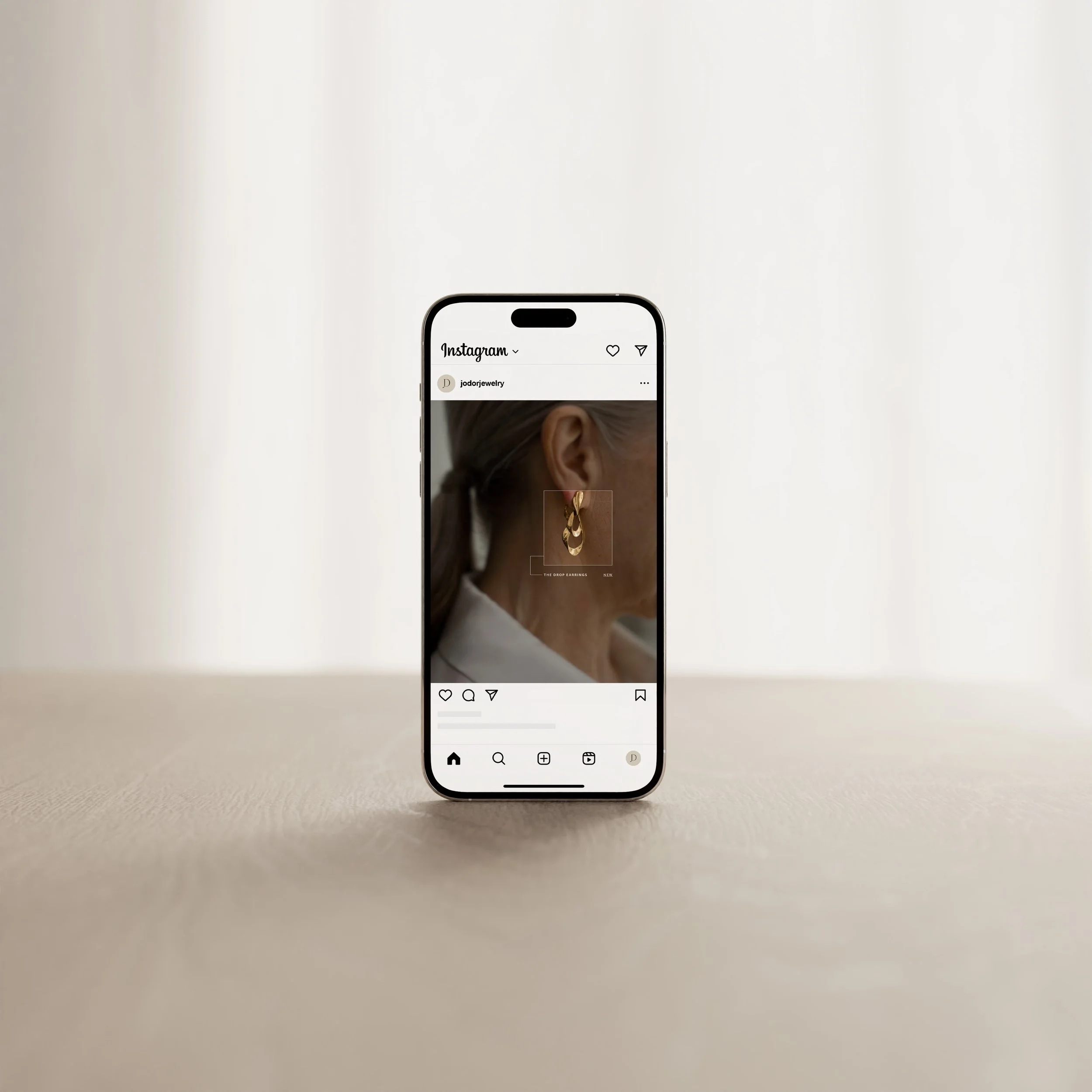
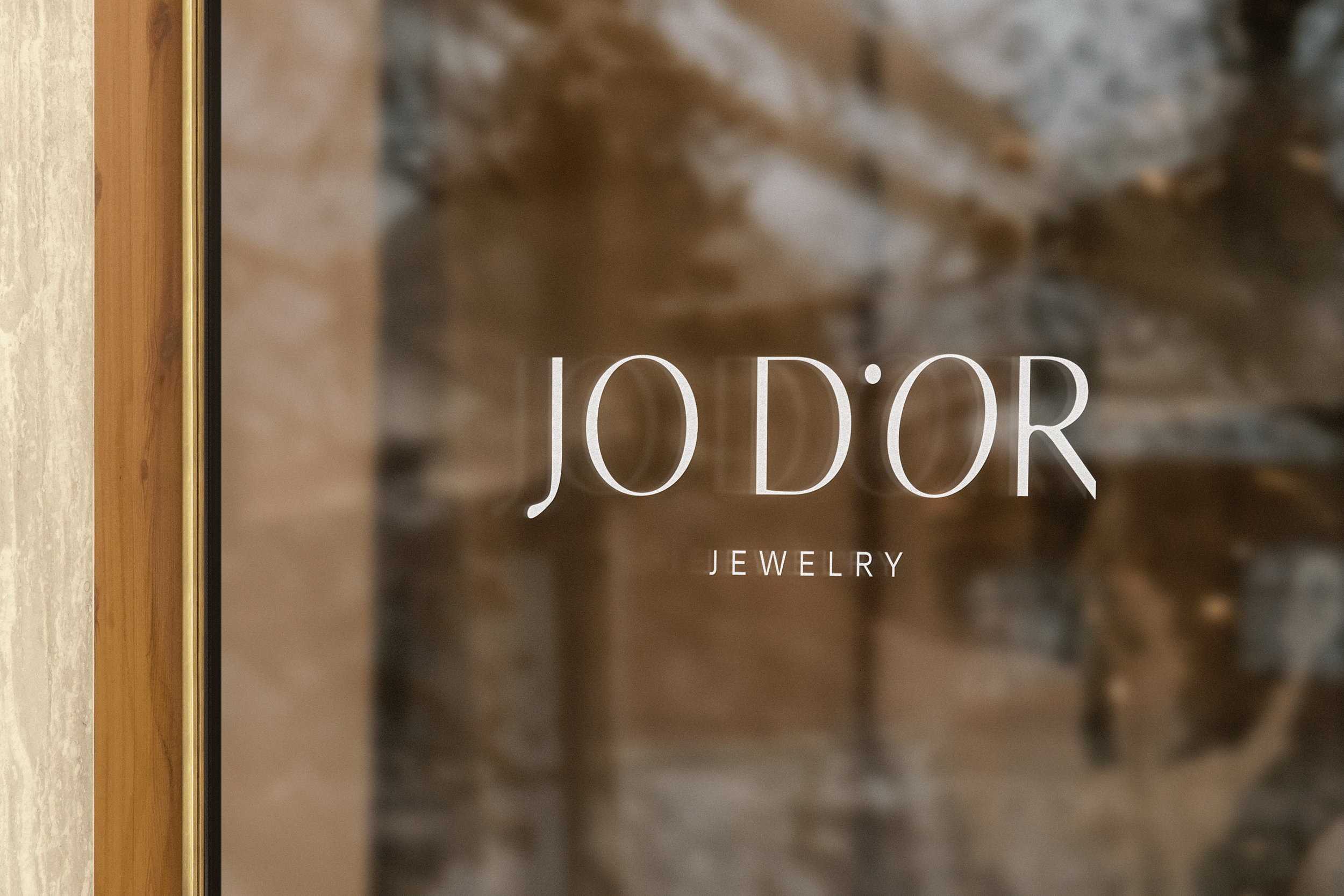
Jo D’or is a jewelry brand created for the modern, intuitive woman—someone who sees beauty as ritual and wears her story like gold. Zoe came to us ready to elevate her brand into something timeless, soulful, and deeply personal. Together, we developed a brand identity that blends softness with structure: a refined logo suite, an earthy editorial color palette, and typography that feels both feminine and empowering. The result is a visual language that captures the essence of Jo D’or—quiet luxury, thoughtful symbolism, and a grounded sense of self.
A look into our
Project Goals
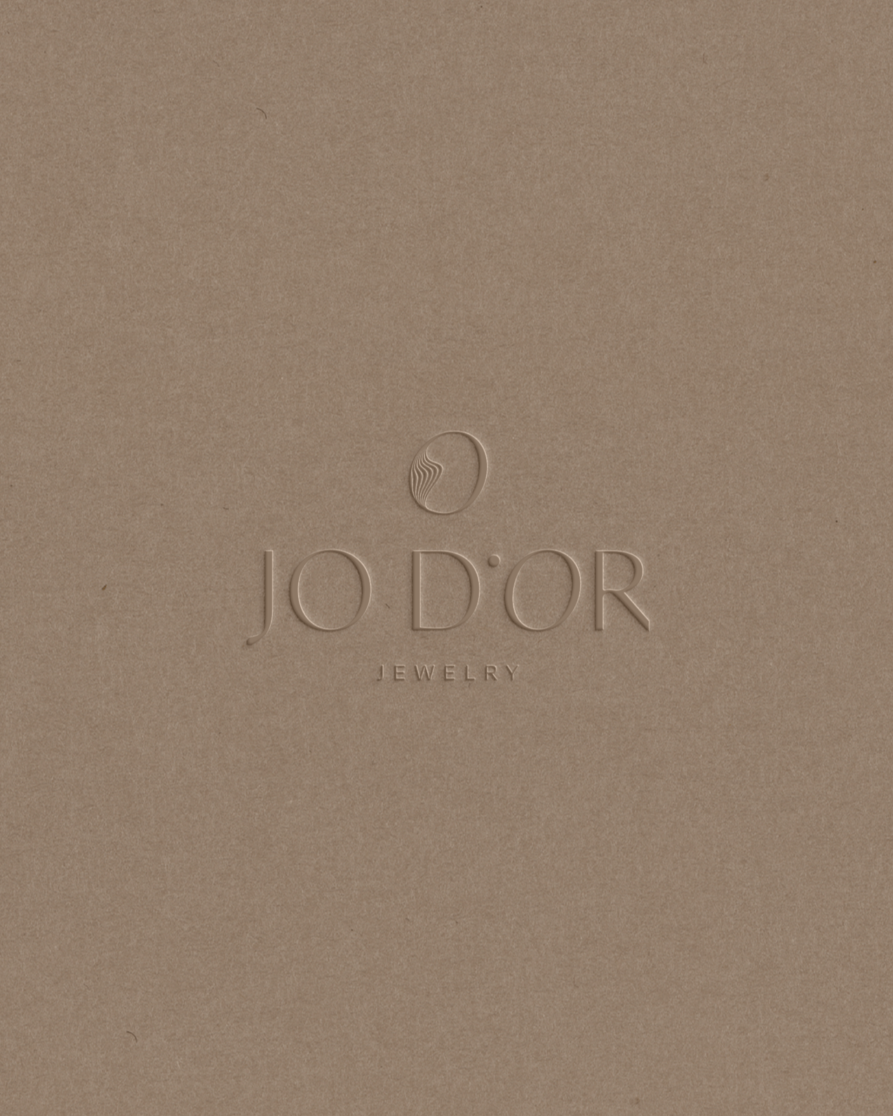
Rooted in the idea that jewelry can be both beautiful and healing, Jo D’or’s brand identity was designed to feel like an extension of the wearer’s soul. We leaned into a clean, editorial direction—pairing a sleek, minimal logo with a rich wine accent color to symbolize depth and sensuality. The serif-and-script typography pairing added an intentional softness, evoking the feel of a handwritten signature. The true heart of the brand lies in the icon: a sketched shape inspired by one of Zoe’s original jewelry designs. We traced it, refined it, and wove it into the logo—creating a mark that feels sacred and personal. A subtle dot between the brand name reinforces the symbolism of a gem, a point of energy, or a golden moment. This identity honors the Jo D’or woman: elegant, grounded, and in tune with her inner world.